Money Movement Case Study
The Overview:
As part of the second phase of the annual overhaul of Finastra’s digital banking offering, our team worked to streamline and simplify the workflows of moving money within the app. This included the reduction of redundant features, reducing clicks for task completion, and updating the UI to match the new design for the dashboard and accounts views.
Team:
Senior UX Designer (me), Junior UX Designer, and Senior UX Designer
My Role:
Our goal was to design an intuitive layout, solving for the reduction and combination of several similar features in order to increase the speed of making internal and external transfers for the user. We planned to accomplish this by promoting performance gains, minimizing implementation time, and adding the ability for Quick Transfers. In doing so, we hope to differentiate our mobile offering from existing move-money applications.
Process:
Senior UX Designer (me), Junior UX Designer, and Senior UX Designer
My Role:
With my role as Senior UX Designer, I worked as a main contributor to the project by helping to define phase objectives with Product and management, conduct user testing and research and to organize and facilitate bi-weekly progress meetings with the team and present finding to upper management.
Objectives:Our goal was to design an intuitive layout, solving for the reduction and combination of several similar features in order to increase the speed of making internal and external transfers for the user. We planned to accomplish this by promoting performance gains, minimizing implementation time, and adding the ability for Quick Transfers. In doing so, we hope to differentiate our mobile offering from existing move-money applications.
Process:


01 Competitive Research:
Venmo, Zelle, Cash App, Google Pay, PayPal, Bank of America, Wells Fargo, USAA and Capitol One.
Venmo, Zelle, Cash App, Google Pay, PayPal, Bank of America, Wells Fargo, USAA and Capitol One.
02 Analysis:
After completing the competitor research, the next step was to take this data and combine it with findings from our own internal analytics tool. Our main goal here was to dig deeper into customer usage.
After completing the competitor research, the next step was to take this data and combine it with findings from our own internal analytics tool. Our main goal here was to dig deeper into customer usage.
- What are the main features being used? How often?
- How many move money features do account holders have?
- How often are users moving money between their accounts? To external accounts?
- What are the main pain points within the move money workflows?
- How many move money features do account holders have?
- How often are users moving money between their accounts? To external accounts?
- What are the main pain points within the move money workflows?
03-04 Personas/Userflows:
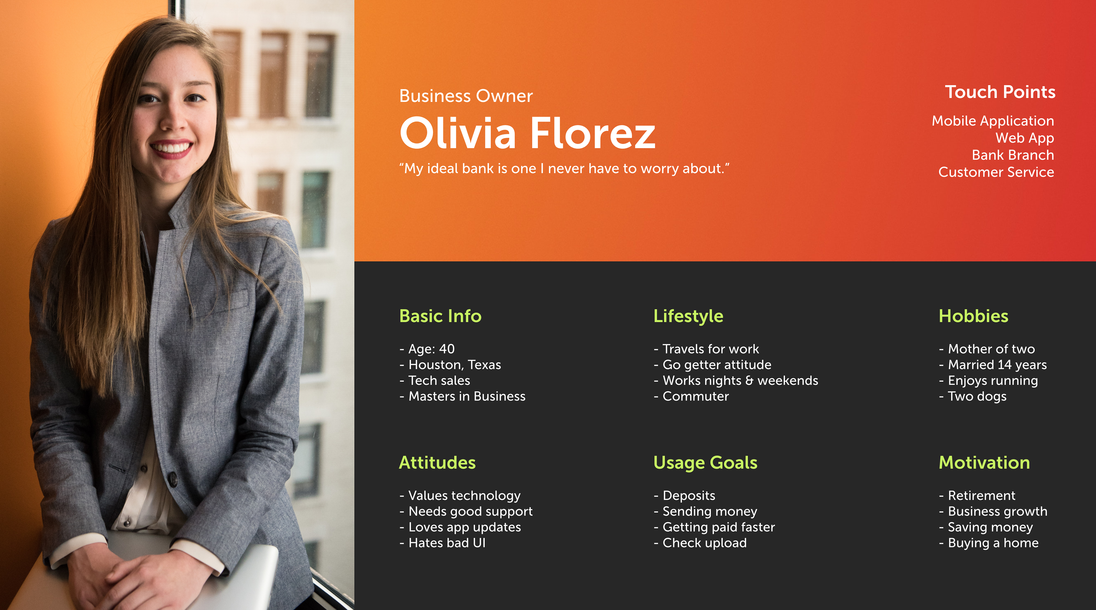
Based on the data analytics and research, we set up three personas (1/3 shown below). We referred to them throughout the entire design and development process.
Based on the data analytics and research, we set up three personas (1/3 shown below). We referred to them throughout the entire design and development process.
05 Wireframes:
While personas are being created, I always start the design process with sketches and low-fidelity wireframes. This is the way I can iterate through many designs quickly without worrying if things are too precise.
While personas are being created, I always start the design process with sketches and low-fidelity wireframes. This is the way I can iterate through many designs quickly without worrying if things are too precise.
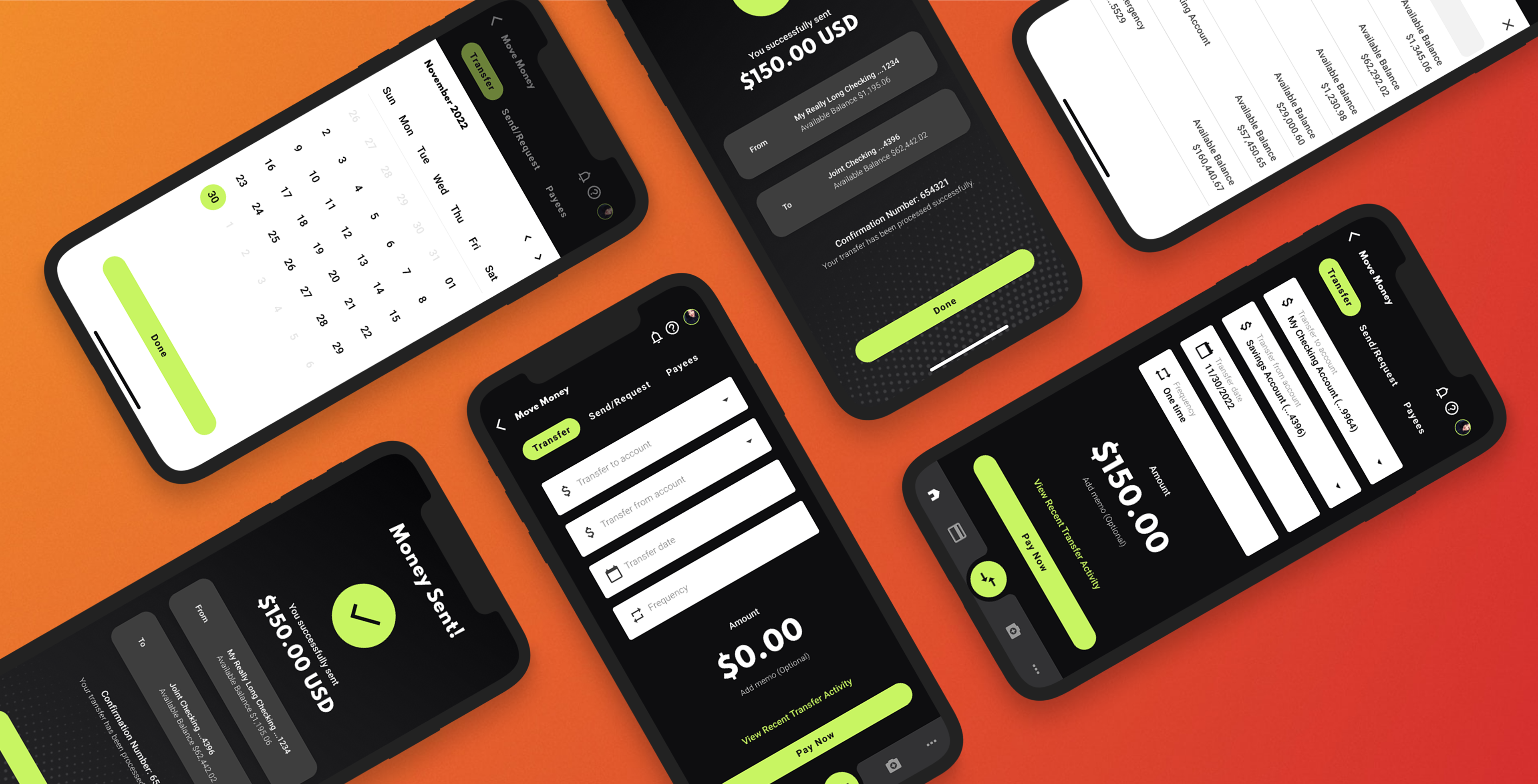
06 Prototypes:
After a flow is agreed on by our designers we create a low-fi prototype. The purpose of the prototype is to ensure we are not leaving any steps out. I always encourage my team to think of worse case scenarios as those are the ones often missed. We also use this time to show in house stakeholders and Devs to get ahead of any troubleshooting.
After a flow is agreed on by our designers we create a low-fi prototype. The purpose of the prototype is to ensure we are not leaving any steps out. I always encourage my team to think of worse case scenarios as those are the ones often missed. We also use this time to show in house stakeholders and Devs to get ahead of any troubleshooting.
07 User Testing:
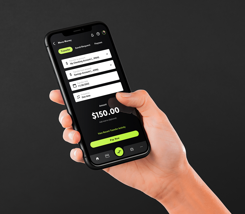
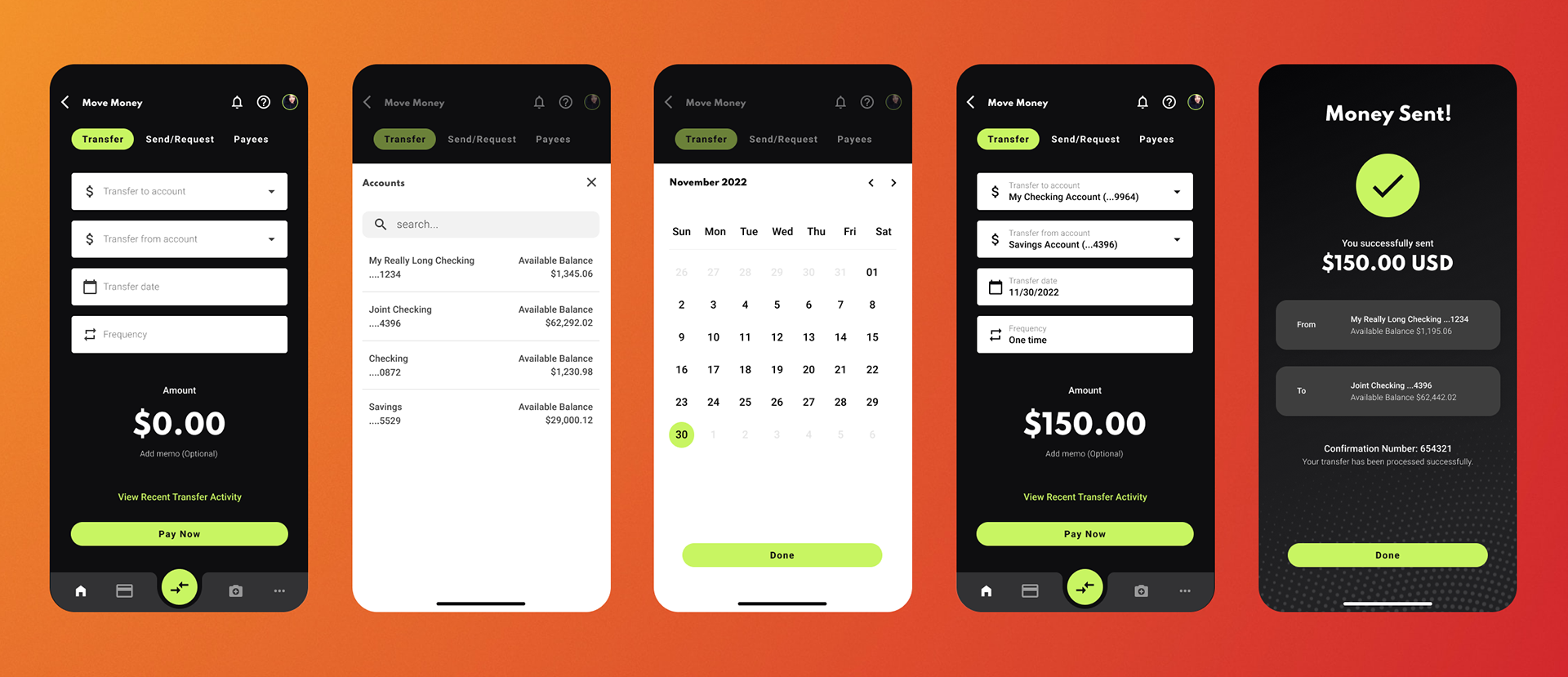
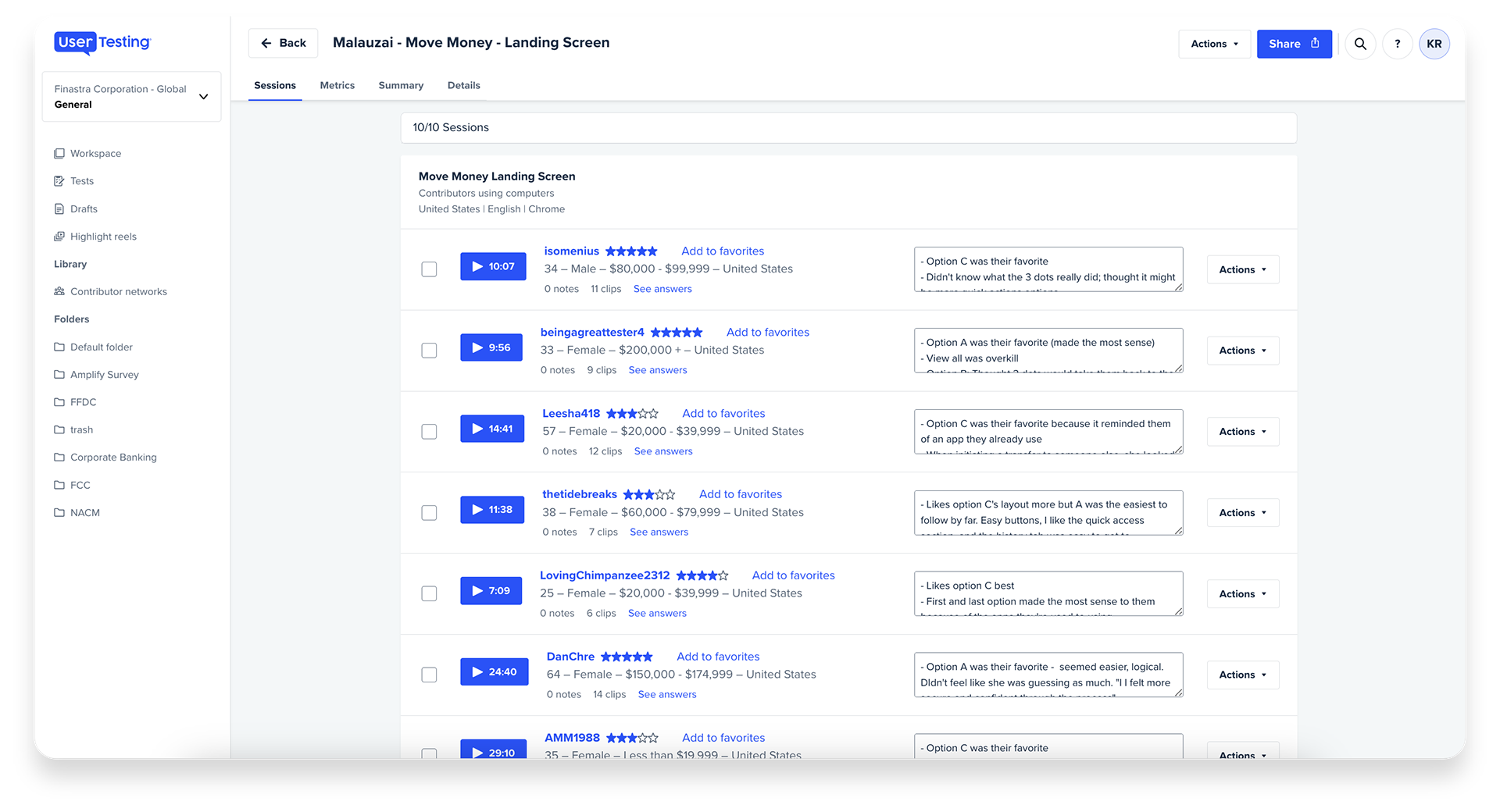
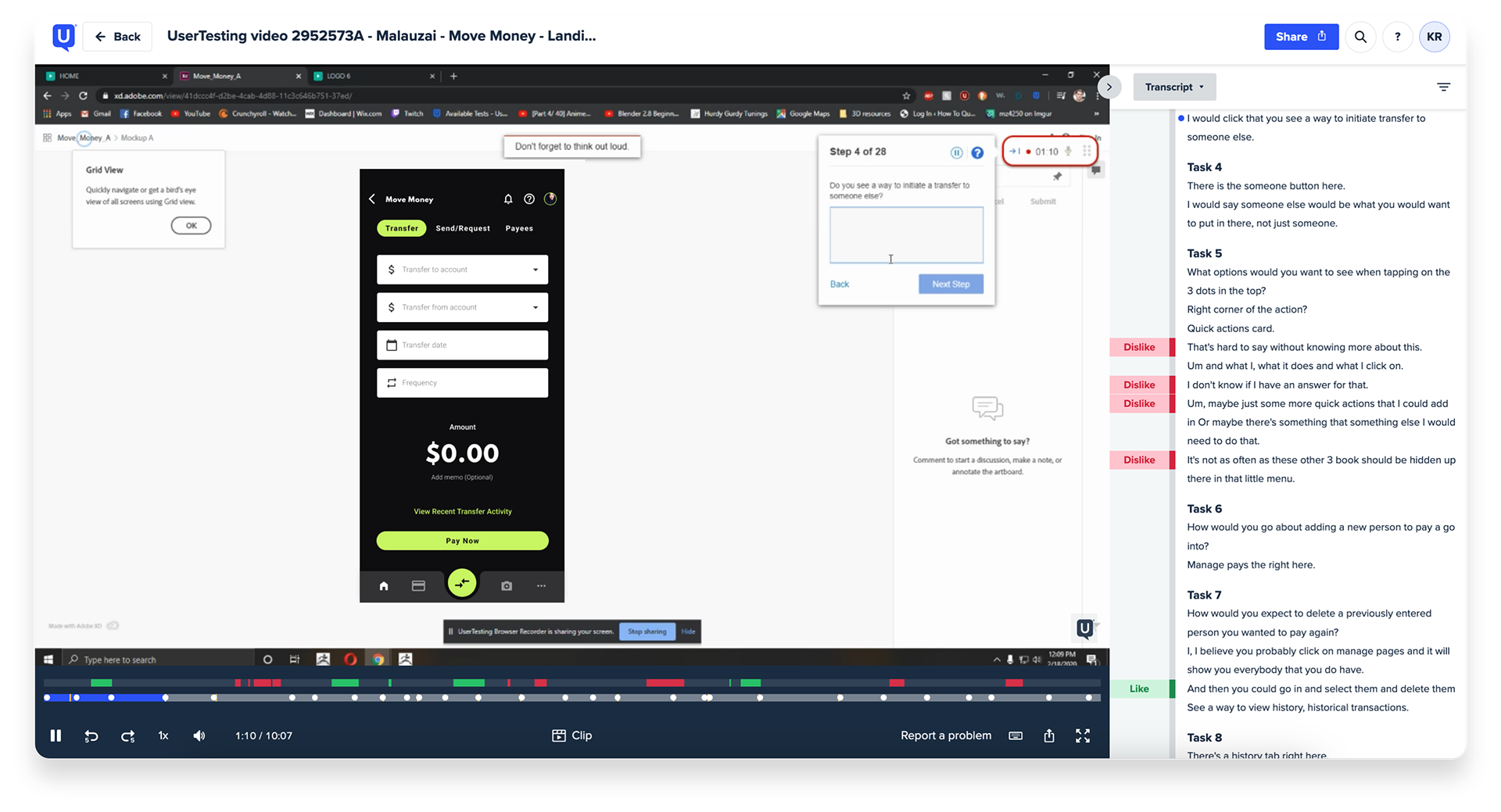
I worked along side another UX Designer to preform user testing on phase one and two of our designs. For the first round of testing, we had ran 10 unmoderated A/B tests using usertesting.com to gain initial feedback on iPhone prototypes of the main Move Money landing page. We worked together to create screener questions, task lists and surveys in order to gather insights on the dashboard layouts.
I worked along side another UX Designer to preform user testing on phase one and two of our designs. For the first round of testing, we had ran 10 unmoderated A/B tests using usertesting.com to gain initial feedback on iPhone prototypes of the main Move Money landing page. We worked together to create screener questions, task lists and surveys in order to gather insights on the dashboard layouts.
Once the first round of testing was completed, we analyzed the results and iterated on our designs based on the feedback received. From the first round, we eliminated Option C as the users felt the history list provided minimal value on the main move money screen. Combining options A and B, we completed a second round of User Testing and found a clear winner between the two.
You can view our test plan here (coming soon).
Tools: Figma, Illustrator & Photoshop / Confluence / Excel / UserTesting
Skills: User Testing / Lo and Hi Fidelity Wireframes / Prototyping / Visual Design