CapMetro Redesign Concept
The Overview:
Commuting on the Austin train was a daily adventure for me from 2016 to 2020. While I loved the ride, the ticket purchasing process through the Austin CapMetro app left much to be desired. The outdated design and confusing navigation made the experience far from enjoyable. But instead of just complaining about it, I decided to put my UX skills to the test and give the app a makeover. I wanted to see how I could improve my own experience and make the process more enjoyable for others. And, of course, strengthen my skills in the process.
Duration:
One Month from concept to pitch
One Month from concept to pitch
Team:
UX Designer (myself)
UX Designer (myself)
Process:
My process for updating the app involved three key steps:
- Evaluating the current functionality and identifying areas for simplification and improvement
- Improving the user interface to ensure a seamless user experience from ticket purchasing to activation
- Keeping ADA compliance top of mind
- Evaluating the current functionality and identifying areas for simplification and improvement
- Improving the user interface to ensure a seamless user experience from ticket purchasing to activation
- Keeping ADA compliance top of mind
Evaluation:
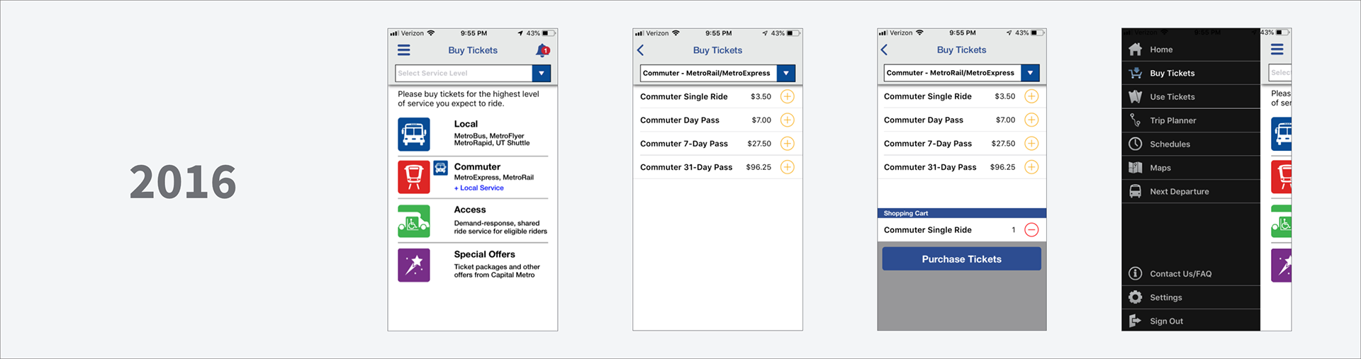
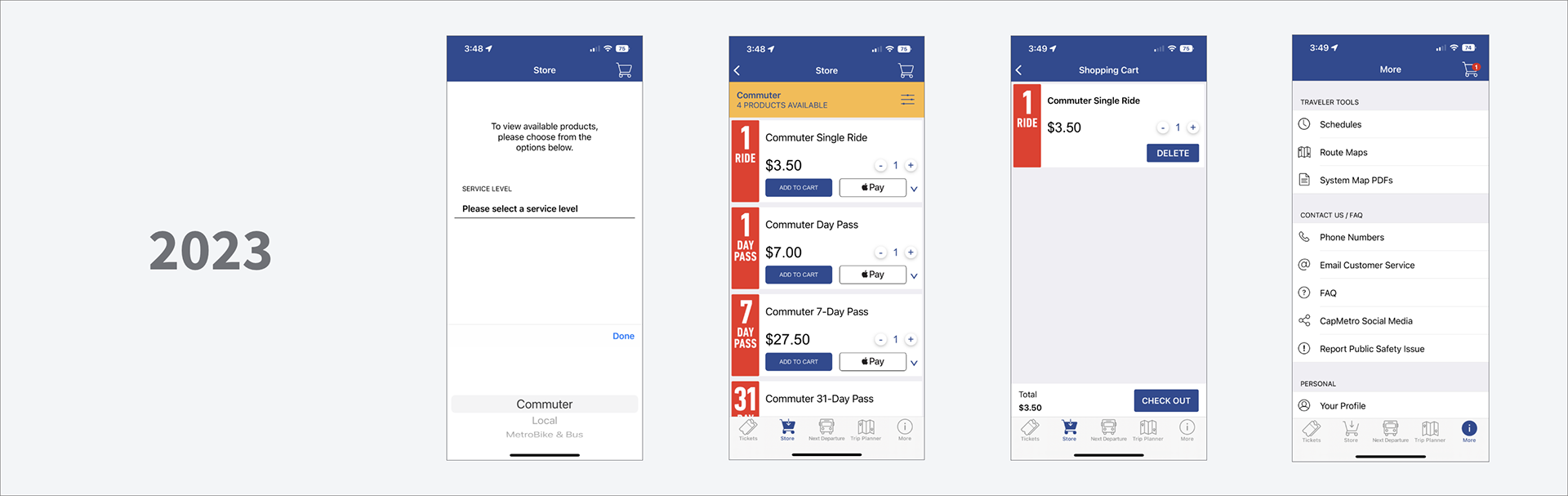
The comparison of the 2016 and 2023 versions of the app shows a lack of effort in making it accessible, with infrequent updates and unreliable results.
The comparison of the 2016 and 2023 versions of the app shows a lack of effort in making it accessible, with infrequent updates and unreliable results.
Improvements:
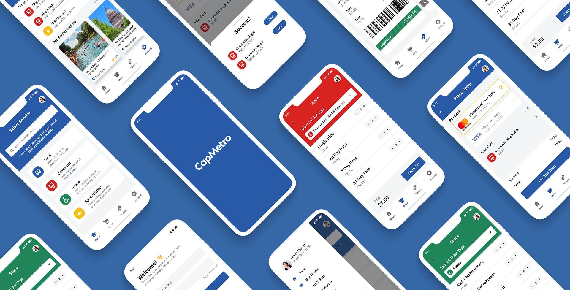
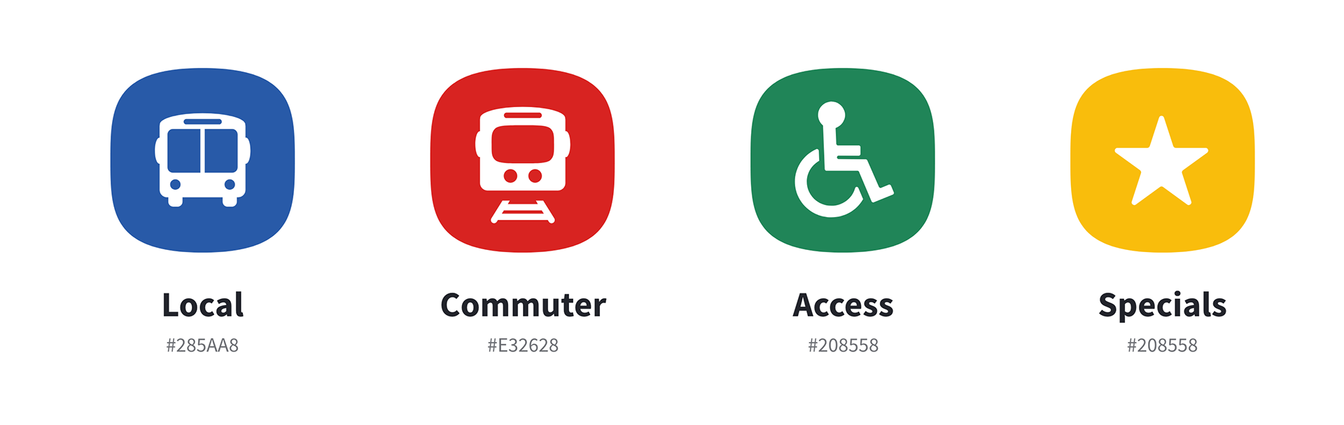
In the redesign of the app, I aimed to maintain the easy ticket buying experience that I appreciated in the 2016 version, while updating it with a new look. The brand colors were incorporated into the navigation, with blue representing MetroBus, red for MetroRail, green for MetroAccess, and yellow for Special tickets, making it easier for users to identify and select the right ticket. To enhance readability for all users, I meticulously chose dark fonts with high contrast.
In the redesign of the app, I aimed to maintain the easy ticket buying experience that I appreciated in the 2016 version, while updating it with a new look. The brand colors were incorporated into the navigation, with blue representing MetroBus, red for MetroRail, green for MetroAccess, and yellow for Special tickets, making it easier for users to identify and select the right ticket. To enhance readability for all users, I meticulously chose dark fonts with high contrast.
Improving:
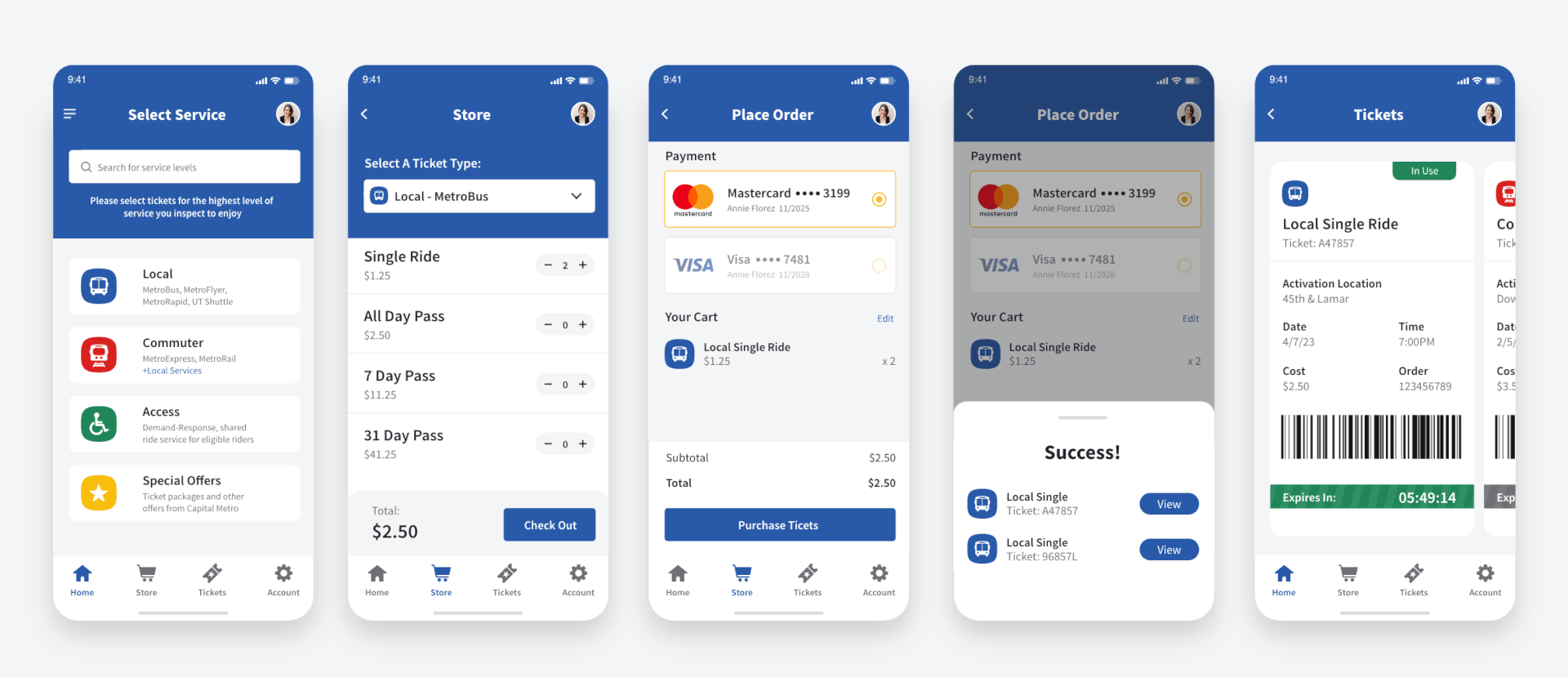
Select Service (Screen 1):
I updated the layout of the Select Service Home screen to maintain its original 2016 style while modernizing the icons and colors. A navigation footer has been added to provide easier access to additional flows.
Select Service (Screen 1):
I updated the layout of the Select Service Home screen to maintain its original 2016 style while modernizing the icons and colors. A navigation footer has been added to provide easier access to additional flows.
Store (Screen 2):
After the user selects a travel method, such as by train or bus, a color (blue, red, green, or yellow) indicates their selection. This color indicator will help the user identify which ticket type has been selected going forward.
Place Order (Screen 3/4):
Paying for train tickets used to be a stressful experience. Sometimes the payment method wouldn't work, and other times you had to rush to complete the payment just to show the conductor your ticket and board the train. Now, with just two taps, you can select your payment method, view your total, and complete the purchase. The updated design, while still inspired by the 2016 layout, now better meets user expectations by allowing easy cart editing and displaying your ticket on the same screen after a successful transaction.
Tickets (Screen 5):
Many train passengers have been issued tickets for not having a valid ticket or not activating it before the conductor's inspection. The new layout was designed to make it easier for both the conductor and the rider. All tickets are displayed in a carousel that disappears after it expires and clearly shows the necessary details to confirm that the passenger purchased their ticket in a timely manner.
User Flow:
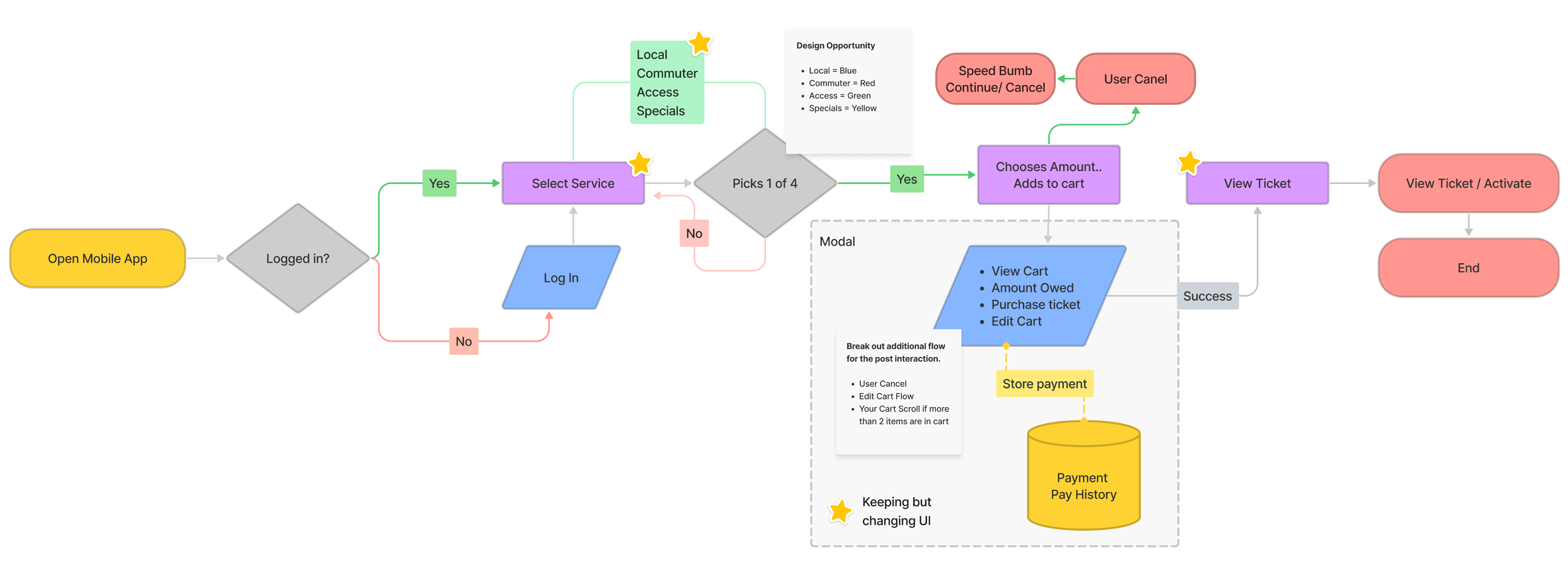
The app's flow always felt straightforward, leading me successfully from point A to B. However, I saw an opportunity to enhance the experience by incorporating branding and reducing the number of taps required for a user.
Many train passengers have been issued tickets for not having a valid ticket or not activating it before the conductor's inspection. The new layout was designed to make it easier for both the conductor and the rider. All tickets are displayed in a carousel that disappears after it expires and clearly shows the necessary details to confirm that the passenger purchased their ticket in a timely manner.
User Flow:
The app's flow always felt straightforward, leading me successfully from point A to B. However, I saw an opportunity to enhance the experience by incorporating branding and reducing the number of taps required for a user.
Extra Materials:
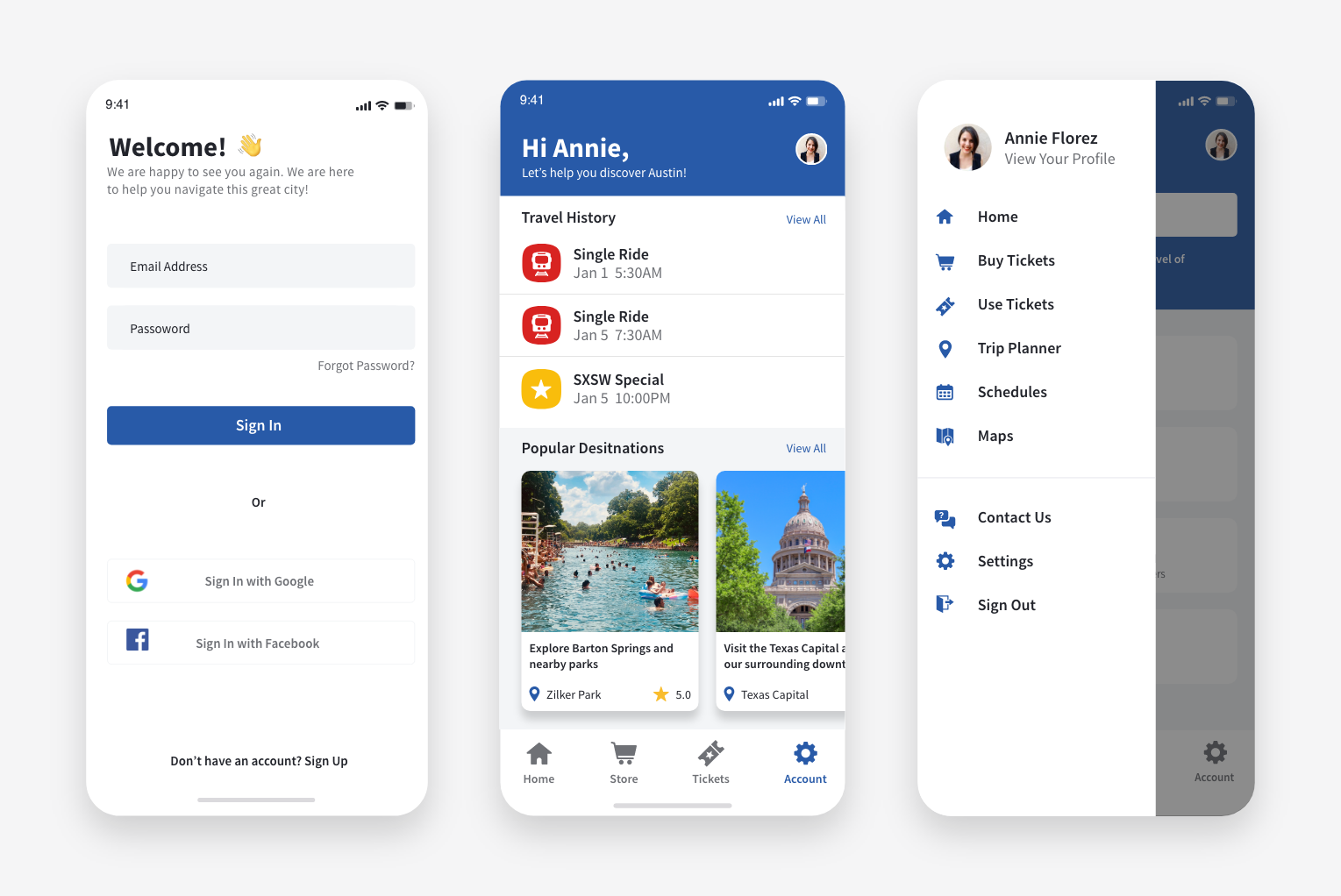
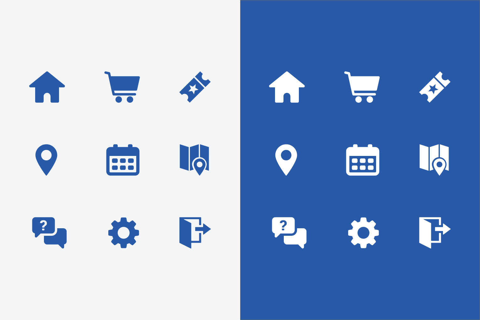
Here are some additional elements I created during the design phase: an updated Login screen that enables new users to sign in through social media accounts, an Account page where a user can view their recent travel history or popular destinations, and an improved icon set that aids menu navigation and enhances ADA compliance.
Here are some additional elements I created during the design phase: an updated Login screen that enables new users to sign in through social media accounts, an Account page where a user can view their recent travel history or popular destinations, and an improved icon set that aids menu navigation and enhances ADA compliance.
Overview:
Although this project remained only a concept and was never brought to fruition, I am proud to showcase the city app concept in my portfolio as it demonstrates my approach to problem-solving through design. The creation of the app involved consideration of a diverse user base, including various ages and abilities, resulting in an accessible and enjoyable design for all.
Although this project remained only a concept and was never brought to fruition, I am proud to showcase the city app concept in my portfolio as it demonstrates my approach to problem-solving through design. The creation of the app involved consideration of a diverse user base, including various ages and abilities, resulting in an accessible and enjoyable design for all.