
Document Center Case Study
The Overview:
I recently took on the challenge of improving the process for managing Statements and Notices. My goal was to create a solution that would make it easier for users to access and manage their documents. After careful consideration and user testing, I developed an intuitive and straightforward flow that allows users to view, download, and opt for eco-friendly e-delivery of their statements and notices. The end result is a platform that offers a seamless, satisfying, and user-friendly experience for keeping track of all their important documents.
Duration:
One year from ideation to production
One year from ideation to production

Team:
UX Designer (me), Product, IOS, Android and Web Developers (roughly three developers per team)
My Role:
UX Designer (me), Product, IOS, Android and Web Developers (roughly three developers per team)
My Role:
As a Senior UX Designer, I was a key contributor to the project, collaborating with Product to define phase objectives and conducting user testing to guide design choices. I facilitated regular progress meetings and presented insights to upper management.
Our problem:
Currently, our users lack the ability to view, search, or mass download their financial documents, putting us at a disadvantage compared to competitors who offer these features. Implementing these capabilities would allow us to offer eDelivery as an option, saving our company money and providing a competitive advantage.
Currently, our users lack the ability to view, search, or mass download their financial documents, putting us at a disadvantage compared to competitors who offer these features. Implementing these capabilities would allow us to offer eDelivery as an option, saving our company money and providing a competitive advantage.
Our results:
Since implementation of Document Center, Finastra's banks have experienced a significant increase in the number of clients choosing eDelivery for their financial documents. This has resulted in over 5000+ downloads of documents a month and a year-over-year growth in usage. By providing this convenient service, we have been able to save time and money on delivery fees while improving our customers' experience.
Since implementation of Document Center, Finastra's banks have experienced a significant increase in the number of clients choosing eDelivery for their financial documents. This has resulted in over 5000+ downloads of documents a month and a year-over-year growth in usage. By providing this convenient service, we have been able to save time and money on delivery fees while improving our customers' experience.


01 Goals:
Our objective was to create an easy-to-use layout while addressing the design needs of three separate interfaces. Our success was measured by the following factors: Security, UI alignment, User flow time out (what if a user does XYZ), Back End & Front End requirements and Load times
Our objective was to create an easy-to-use layout while addressing the design needs of three separate interfaces. Our success was measured by the following factors: Security, UI alignment, User flow time out (what if a user does XYZ), Back End & Front End requirements and Load times
02 Competitor Research:
To design a user-friendly document center and delivery flow, I conducted competitor research on the solutions offered by leading financial institutions including Bank of America, Wells Fargo, USAA, and Capitol One. My findings informed my approach in addressing the following key questions:
To design a user-friendly document center and delivery flow, I conducted competitor research on the solutions offered by leading financial institutions including Bank of America, Wells Fargo, USAA, and Capitol One. My findings informed my approach in addressing the following key questions:
- What are the most frequently downloaded documents and how often?
- How frequently do users change their delivery preferences?
- Is it possible to implement bulk downloading of Statements and Notices?
- What are the technical challenges for each team in implementing this new flow?
- How many email addresses can a user link to their delivery preferences?"
- How frequently do users change their delivery preferences?
- Is it possible to implement bulk downloading of Statements and Notices?
- What are the technical challenges for each team in implementing this new flow?
- How many email addresses can a user link to their delivery preferences?"
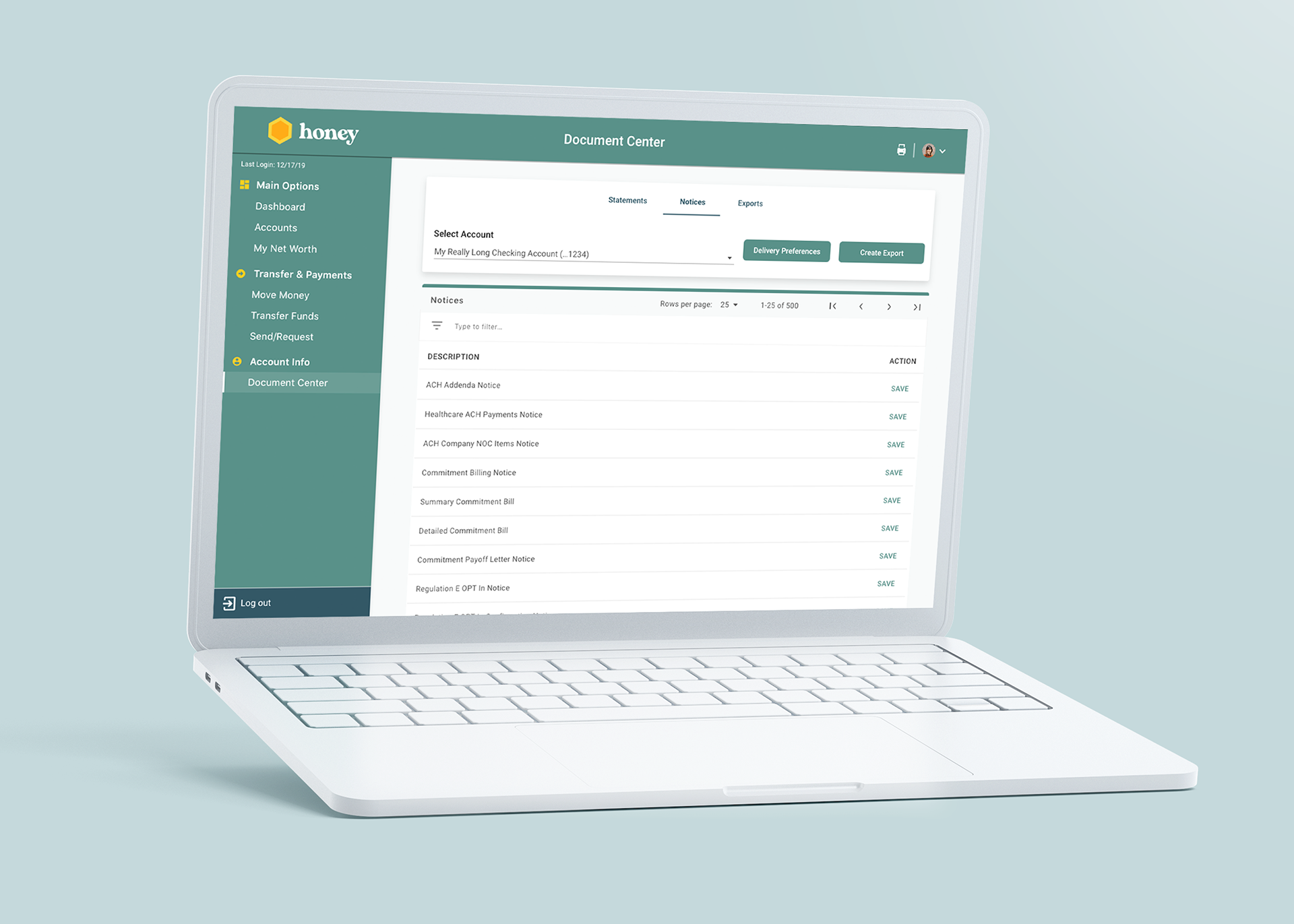
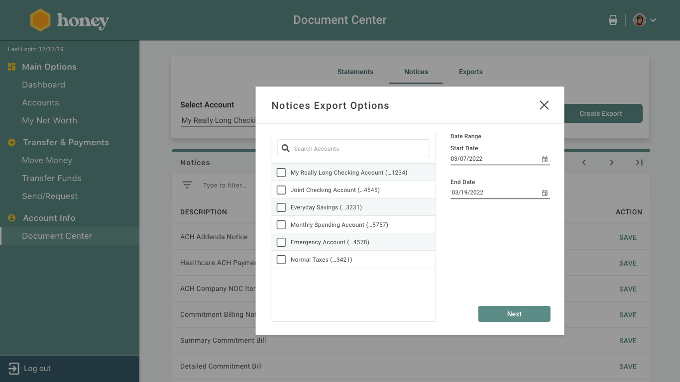
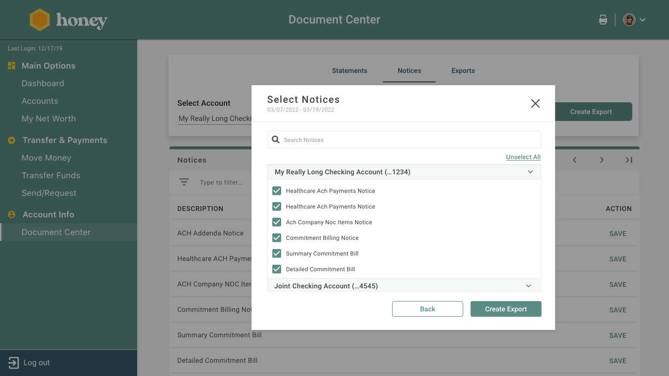
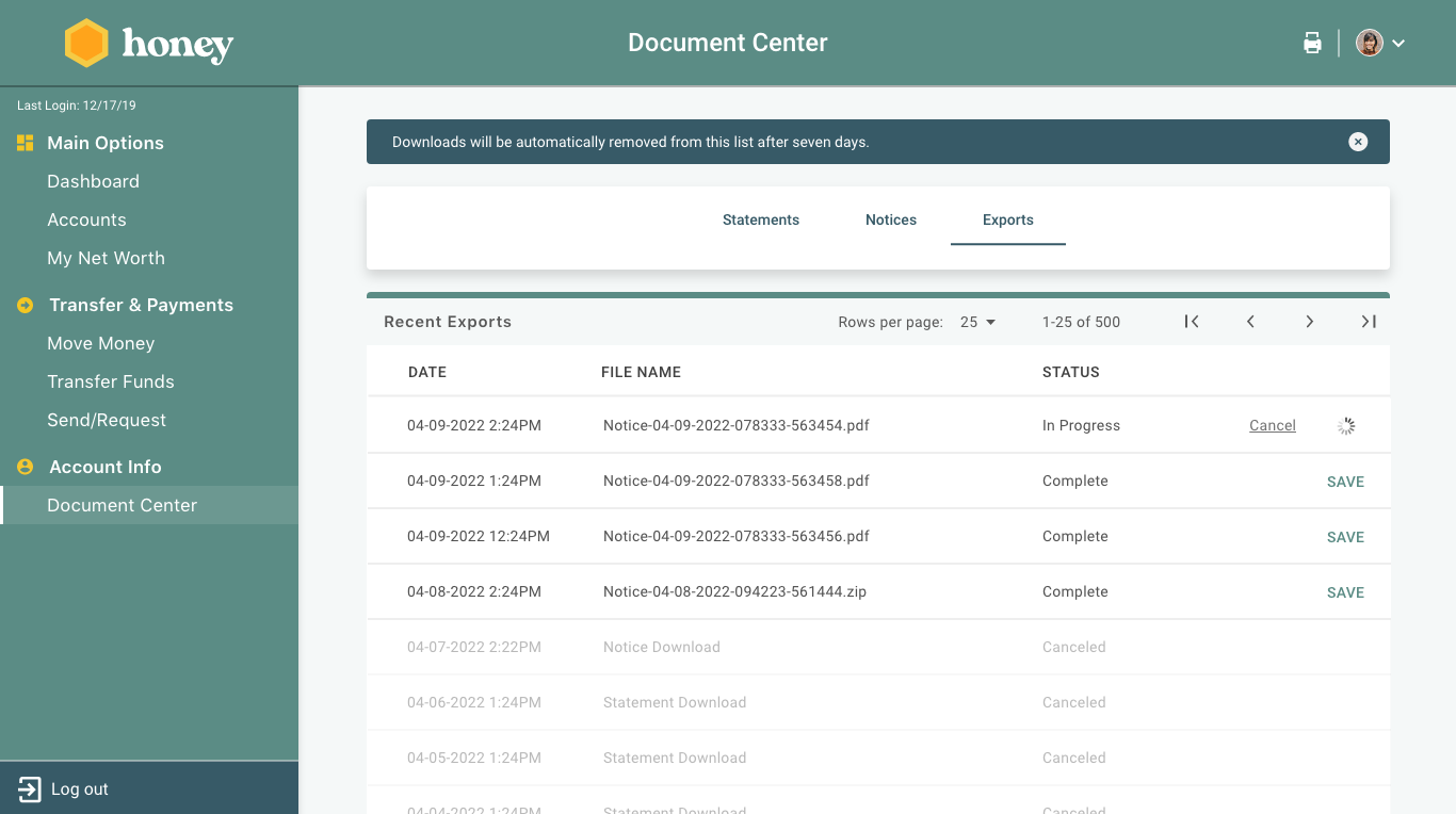
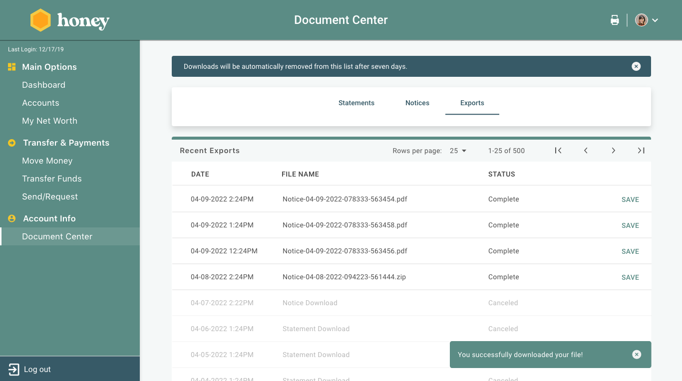
03 Prototypes: Web Example
To ensure seamless collaboration, I concurrently developed prototypes for iOS, Android, and web. I created various iterations and closely worked with developers to ensure they fully understood what they would be coding. By using native components, I facilitated quicker development by allowing developers to utilize existing UI elements.
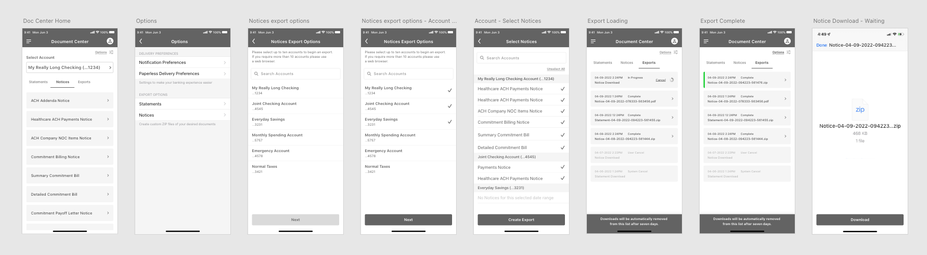
Creating an export:
To ensure seamless collaboration, I concurrently developed prototypes for iOS, Android, and web. I created various iterations and closely worked with developers to ensure they fully understood what they would be coding. By using native components, I facilitated quicker development by allowing developers to utilize existing UI elements.
Creating an export:
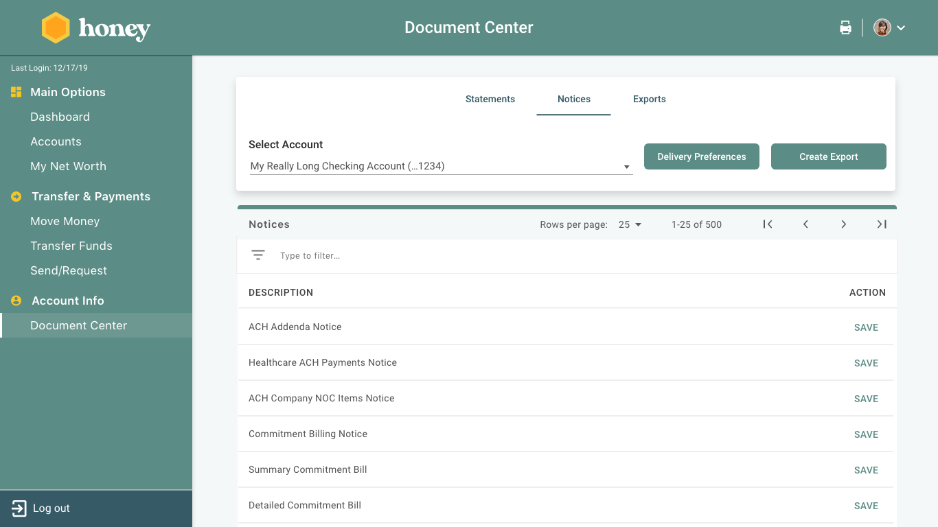
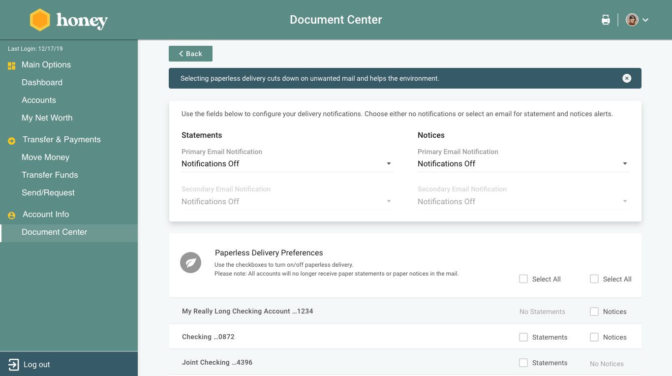
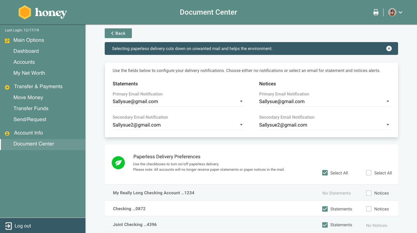
Opting for eDelivery:
04 User Testing:
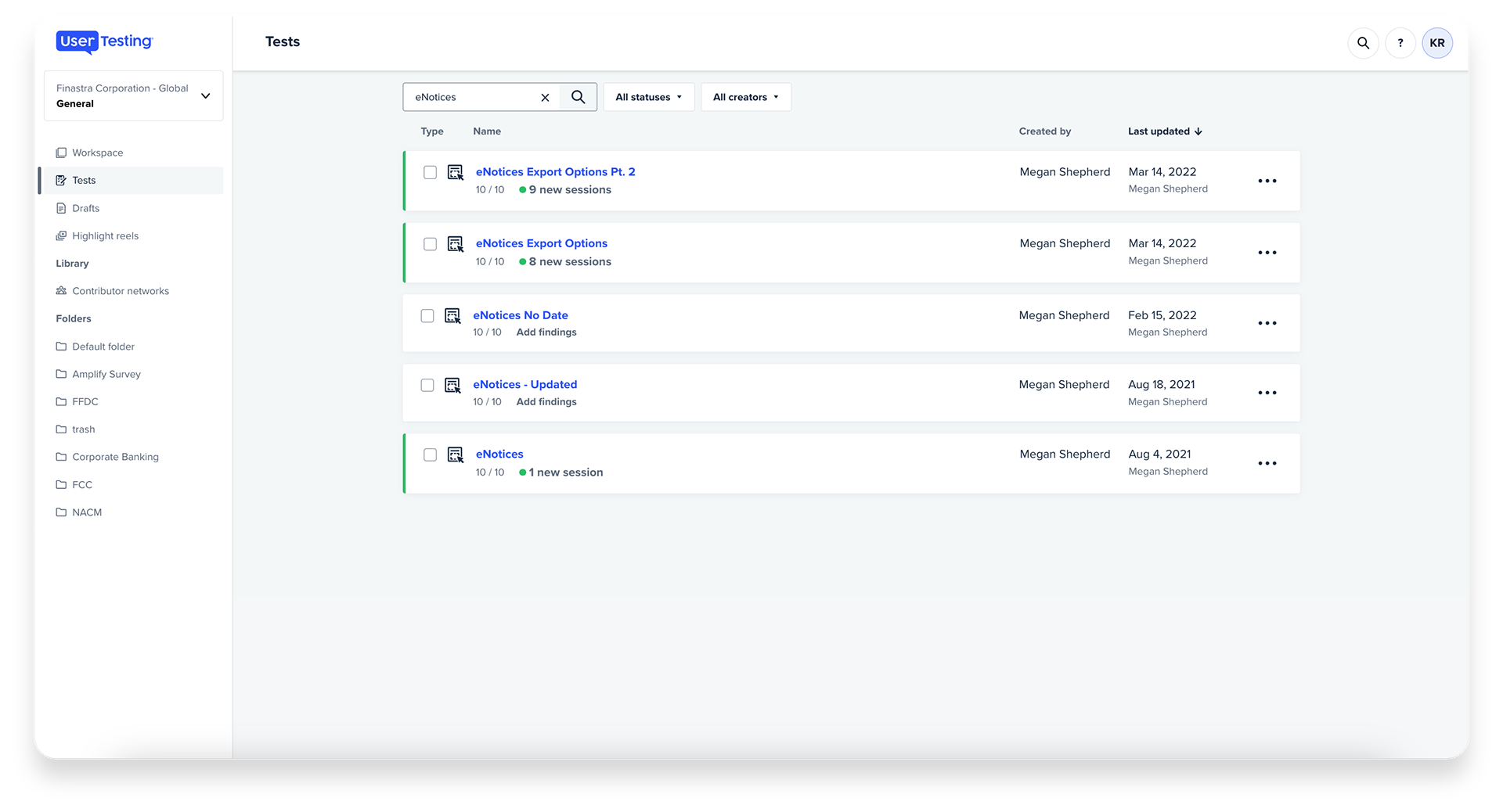
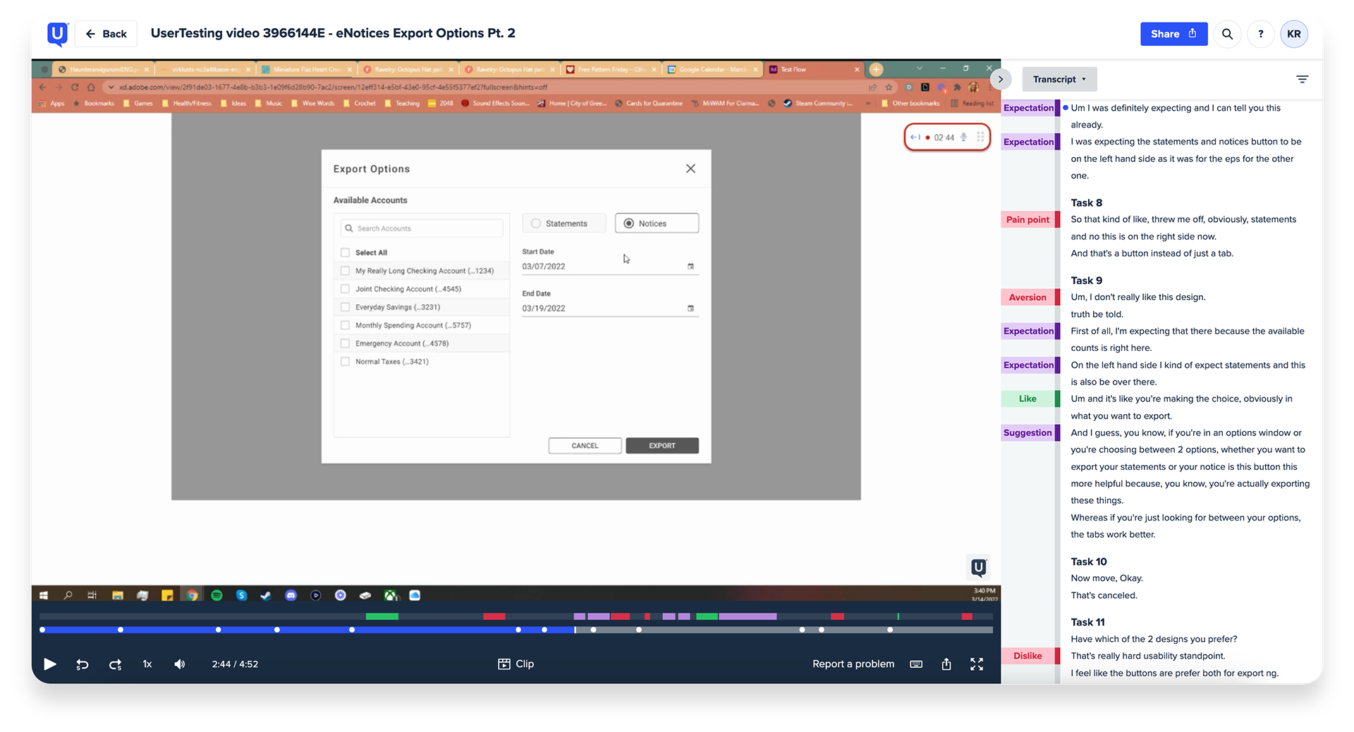
I worked along side another UX Designer to preform user testing on phase one and two of our designs. For the first round of testing, we had ran 10 unmoderated A/B tests using usertesting.com to gain initial feedback on Web prototypes of the main Export Options modal. We worked together to create screener questions, task lists and surveys in order to gather insights on the layouts.
After completing the first round of testing, we evaluated the results and made updates to our designs based on user feedback. Our users expressed a clear preference for separating Notices and Statements, which would improve their understanding of which documents they were downloading which congruently simplified our back-end operations.
05 Iterations: Mobile Low-Fi Example
The Document Center project represented a significant undertaking for Finastra, as it not only needed to be made available for our existing customers but also required a cross-platform design approach to ensure consistency across devices. The project underwent multiple iterations and restarts, reflecting the dedication and tenacity required to deliver a solution that meets both user and developer needs. I take pride in including this project in my portfolio, as it showcases the effort and attention to detail that was invested in creating an optimal outcome.
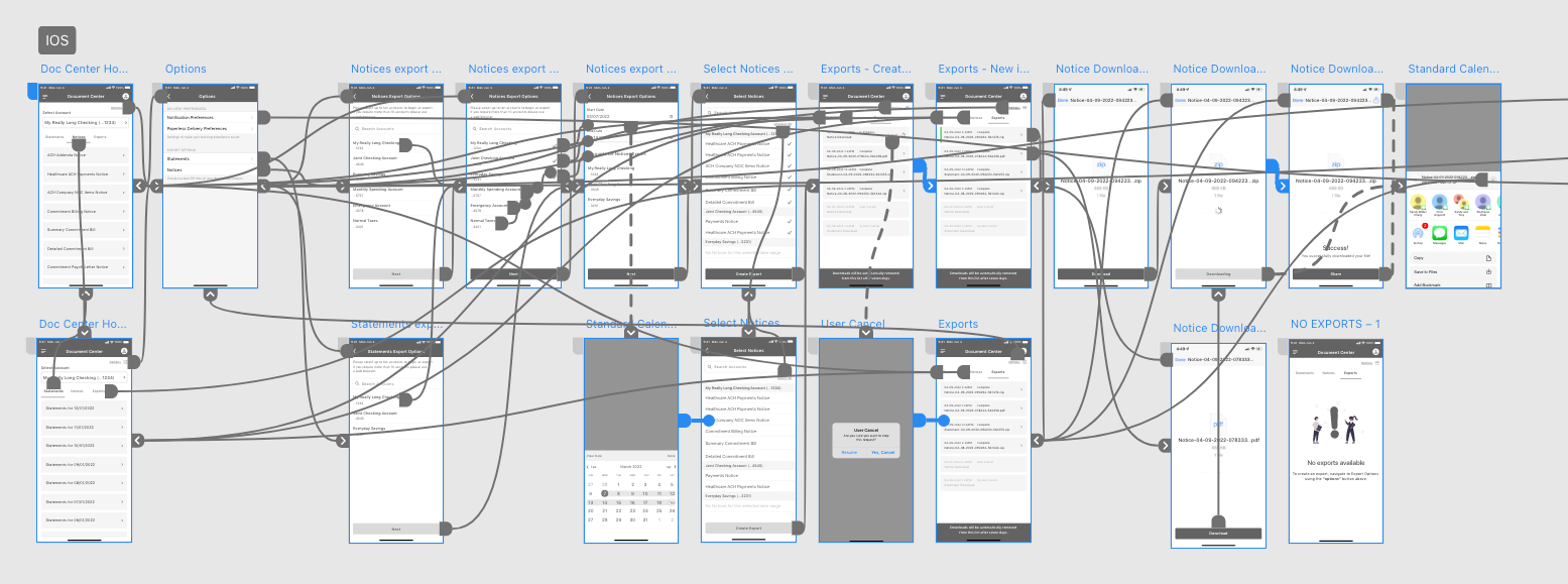
06 Dev Hand Off:
Throughout the project, I maintain constant communication with developers, but I also provide supplementary documentation to ensure a smooth hand-off. This documentation includes any unique behaviors of certain screens or noteworthy details that require attention. In combination with the developer specifications provided by XD/Figma, this approach has facilitated a more accurate end result when developers demonstrate their progress. The documentation serves to align both sides of the project and eliminate the possibility of any oversights. A viewing of this project's documentation can be found here.
View the prototypes:
View the Web prototype here
View the Mobile prototype here
View the prototypes:
View the Web prototype here
View the Mobile prototype here

Tools: Adobe XD, Illustrator & Photoshop / MS Teams / Jira
Skills: User Testing / Lo and Hi Fidelity Wireframes / Prototyping / Visual Design / Interaction Design